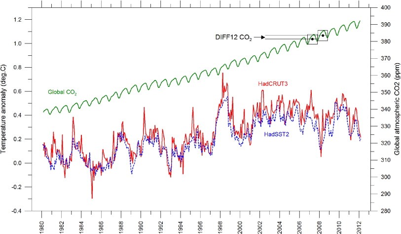
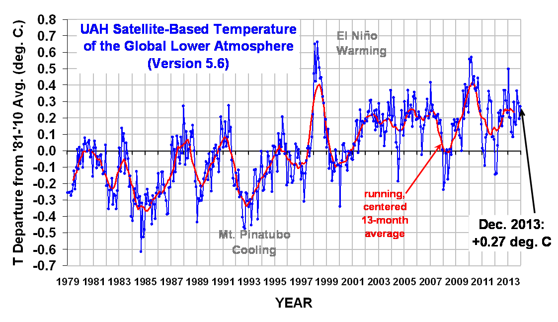
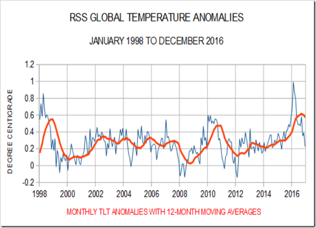
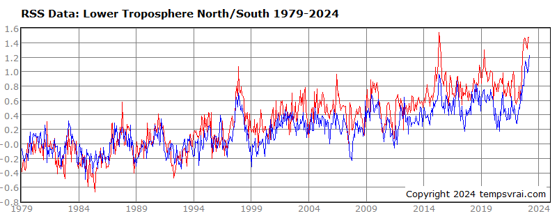
I think you know very well what's coming, and I'm tiring of this as much as you are. So I'm going to assume your answer is the same as I'd expect from anyone with an IQ over 80 - that the three charts show essentially the same trend 1998-2012, with no obvious warming.
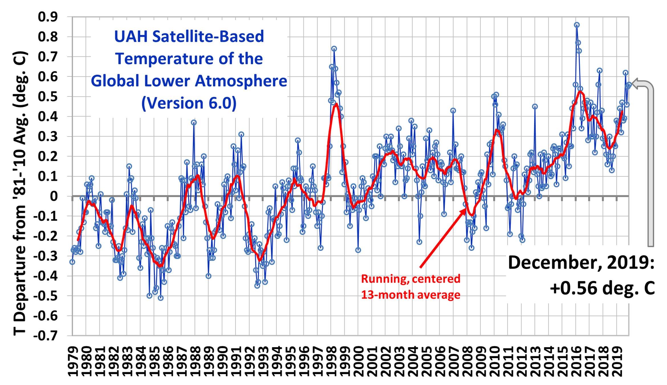
Here are the up-to-date charts for those three sources - HadCRUT, then UAH, then RSS.
One of the charts has undergone a dramatic transformation compared with the earlier version, while the other two are more or less unchanged.
HadCRUT was infamously altered in 2015
to show that the pause never happened because a) the climate models could not account for the pause and b) world leaders were asking uncomfortable questions about the pause and the IPCC required a tool to whip them into line with the Paris summit around the corner.
This alone validates my skepticism, and is no different in principle to any of the other major manipulations where data is tortured until it confesses what its tormentors want to see - manipulations which invariably either lower the past or raise the present, or both. Sure it can be explained away and validated by like-minded colleagues using the broken peer-review system. But explaining away the hockey stick, Climategate, the thriving polar bear population, our own BoM's methods and overt narrative, Tim Ball, John Bates, Al Gore, failed models... the list goes on.
In light of the above, a healthy skepticism is the only sensible attitude for the layperson to take.
Sure, the planet is warming modestly, and only a genuine "denialist" would dispute it. But what you people are subscribing to is akin to Reece Conca's playing statistics being adjusted to make him look like a gun player. The concern and even worry it is causing some people is dead set criminal.
Stick to the truth in all things.
Out.