Just wondering how long the club has had the new logo as we are still using the old one at club function.
-
IMPORTANT // Please look after your loved ones, yourself and be kind to others. If you are feeling that the world is too hard to handle there is always help - I implore you not to hesitate in contacting one of these wonderful organisations Lifeline and Beyond Blue ... and I'm sure reaching out to our PRE community we will find a way to help. T.
How long have we had the current logo?
- Thread starter Tigermad2005
- Start date
You are using an out of date browser. It may not display this or other websites correctly.
You should upgrade or use an alternative browser.
You should upgrade or use an alternative browser.
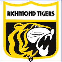
Personally have never liked the new one as the design company did a complete ripoff of the Tiger beer logo.
I liked the previous logo and the old tiger running with a ball under its paw.
But, from a design perspective, this one is more striking and noticeable. It is a better piece of design. Also very flexible, can be used in cut-down versions and an animation.
DS
But, from a design perspective, this one is more striking and noticeable. It is a better piece of design. Also very flexible, can be used in cut-down versions and an animation.
DS
Tigers of Old said:Personally have never liked the new one as the design company did a complete ripoff of the Tiger beer logo.
Let's not say anymore about that or it could develop into a Men At Work-type litigation debacle.
Yep, 1977-1990 will always be the true Richmond logo to meTigers of Old said:http://logos.wikia.com/wiki/Richmond_Football_Club
")
I suppose it's plastered in my brain as the logo from my earliest footy memories and remained in place for a good portion of my childhood.
Correction 1977-1988.Panthera Tigris said:Yep, 1977-1990 will always be the true Richmond logo to me
I suppose it's plastered in my brain as the logo from my earliest footy memories and remained in place for a good portion of my childhood.
The current one is too cartoonish, would prefer a more classic look of the 80s logo with the RFC on the jack Dyer medal
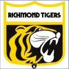
Giardiasis said:The current one is too cartoonish, would prefer a more classic look of the 80s logo with the RFC on the jack Dyer medal
Yep. Looks more like a wildcat than a tiger.
Tigers of Old said:the design company did a complete ripoff of the Tiger beer logo.
got paid a lot of money to rip off the Tiger beer logo
