Nice cherry picking there by Spencer and Christie et al.
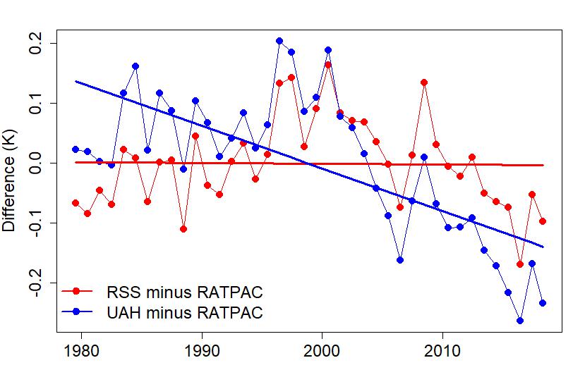
Have a good look at the difference graph I posted which showed the variation between the balloon data compared to 2 satellite data sets UAH (Spencer and Christie) and RSS. If you were Spencer and Christie and you were going to pick a year which puts your data in the best light, which year would you pick? The year where the blue dot is the closest to 0 on the vertical axis and is closer than the red dot - which year would that be? Ooh it's 2005 the very year they used in their article. Why did they do this? The article came out in the middle of 2018, why stop at 2005? Could it be that 2005 fits their agenda the best?
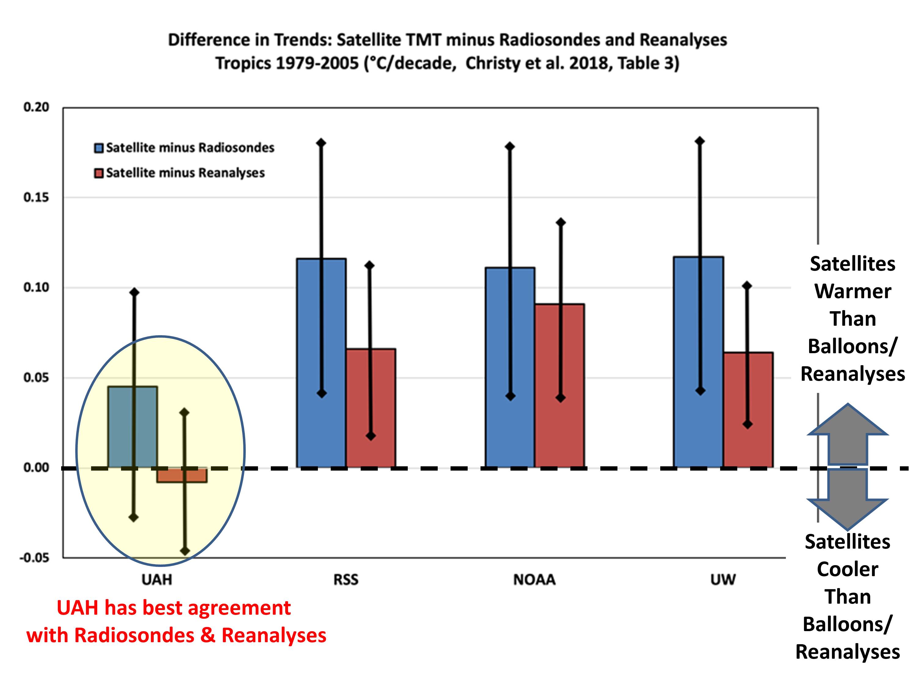
But let's go further. It was nice of you to make a graph out of Christie, Spencer et al's table but what exactly is being measured here - is it world temperature? Well, no, it is temperature in the tropics only, specifically for latitudes from 20S to 20N, so it ain't the whole planet.
But while it was nice to go down the little rabbit hole of satellite measurements, it remains the case that surface temperature data is the best data, it is more accurate, look at this explainer:
You might also want to read this recent paper from NASA:
https://climate.nasa.gov/news/2943/...are-getting-future-warming-projections-right/
It contains this graph:
They have gone back to the forecasts of climate models from 2004 and the models' forecasts are trending the same way as the surface temperature record.
It is warming and we are seeing the effect now.
Time to take action.
DS

 www.abc.net.au