Global Warming | PUNT ROAD END | Richmond Tigers Forum
  • IMPORTANT // Please look after your loved ones, yourself and be kind to others. If you are feeling that the world is too hard to handle there is always help - I implore you not to hesitate in contacting one of these wonderful organisations Lifeline and Beyond Blue ... and I'm sure reaching out to our PRE community we will find a way to help. T.

Global Warming

Baloo

Delisted Free Agent
Nov 8, 2005
44,178
19,049
"And the Global Warming Medal for 2019-20 goes to... LeeToRainesToRoach!"

- Richard Di Natale


raw
 
  • Like
Reactions: 1 user

HR

Tiger Superstar
Mar 20, 2013
2,444
1,523
Back to the BoM for a second, and a little observation of my own...

I noticed the maximum daily temperature recorded for Melbourne on Sunday 29/12/19 is shown by the BoM as 33.2 degrees. Having monitored the Melbourne temperature on that day while watching the cricket and keeping tabs on the bushfires and not seen it exceed 27.0 degrees, I emailed the BoM to suggest that their daily maximum for 29/12 may be in error.

The response received today stated that the daily maximum is recorded between 9am and 9am, and that the maximum for "Sunday December 29th" was recorded at 8:58am on Monday December 30th, and therefore there is no error in the data. Monday was a one-off hot day with a maximum of 40.8 degrees, so the BoM effectively "double dips" in such circumstances, reporting a false maximum for the previous day and enabling it to claim more "record hot" months and years.

Naysayers may well try to justify this as valid practice, but to me, "Sunday December 29th" covers the period from midnight to midnight, and nothing outside. Forgive me if my faith in the Bureau has not been restored...
Wow. Why are there no souls out to destroy this comment L2 or cast aspersions about who you are and how you portray yourself?
 
Last edited:

DavidSSS

Tiger Legend
Dec 11, 2017
10,719
18,363
Melbourne
The BOM has always measured max and min temps between 9am and 9am. Not sure why they do this but I suspect it might have something to do with when the staff went out and looked at the temperature stations back before they could store data. In any case, it has always been this way and changing it would lead to inconsistent data and more squealing about changing records from the deniers.

As for the UAH data it is not more accurate than RSS. How do we know this? Well, there is also another set of data from the lower troposphere, it comes from weather balloons (Radiosonde Atmospheric Temperature Product for Assessing Climate or RATPAC) and we can compare.

In fact, Spencer knows this, in a reply to a 2015 comment on his own website he stated:
most of the radiosonde statistics are still better in UAH than RSS. John Christy does those.

Oh really?

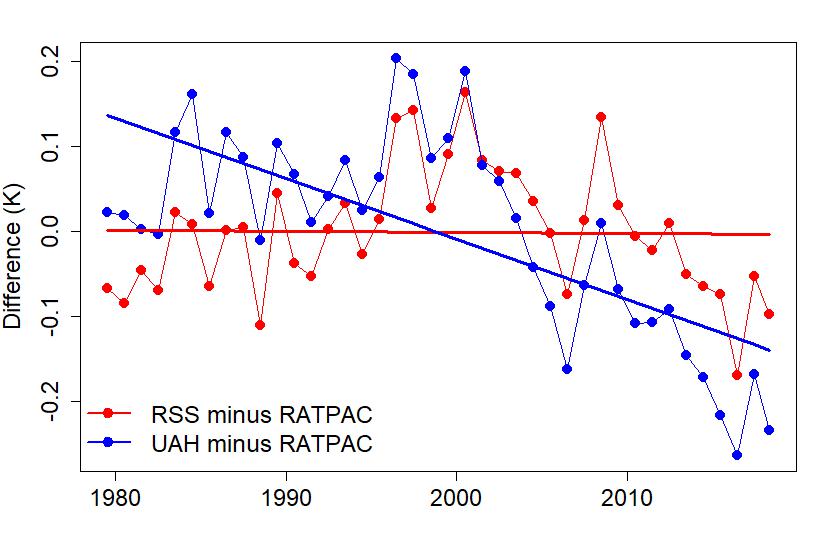
Here's a graph of the difference between what RATPAC finds in terms of temperature changes and what RSS and UAH (the 2 satellite measures of temperatures):

diffrat.jpg


RSS is very very close to the balloon data, UAH isn't. Spencer lied (but what's new?).

Time you looked at some real data, not cherry picked and skewed data.

Sorry I confused my deniers, yep, it is Christie not Curry who fudges data with Spencer to create UAH.

By the way, I live on the surface of the planet, not in the lower troposphere and the surface temperature data is more reliable, just less convenient for some.

DS
 

LeeToRainesToRoach

Tiger Legend
Jun 4, 2006
33,186
11,546
Melbourne
Wow. Why are there no souls out to destroy this comment L2 or cast aspersions about who you are and how you portray yourself?

They are probably like me and don't understand the logic behind it. I'm sure there is a reasoning that sounds impressive, but it's hardly an accurate record of the weather that Melburnians experienced that day.

The response I received was curt and to the point and didn't invite further enquiry. So I didn't.
 
  • Like
Reactions: 1 user

KnightersRevenge

Baby Knighters is 7!! WTF??
Aug 21, 2007
6,787
1,229
Ireland
That too, my favourite non appearance your worship, Science, Math n most other things educational. Cook the crap out of 2 billion ton of really heavy coal n wind up with 7 billion ton of gas floating around in the sky, sneaky bastards is that something like inflation? Musta been some fancy sack n scales they had way back then to catch n weigh all that fluffy gas.

Coburg did the hard bit for you. Smile and nod, smile and nod.
 

LeeToRainesToRoach

Tiger Legend
Jun 4, 2006
33,186
11,546
Melbourne
As for the UAH data it is not more accurate than RSS. How do we know this? Well, there is also another set of data from the lower troposphere, it comes from weather balloons (Radiosonde Atmospheric Temperature Product for Assessing Climate or RATPAC) and we can compare.

In fact, Spencer knows this, in a reply to a 2015 comment on his own website he stated:


Oh really?

Here's a graph of the difference between what RATPAC finds in terms of temperature changes and what RSS and UAH (the 2 satellite measures of temperatures):

diffrat.jpg


RSS is very very close to the balloon data, UAH isn't. Spencer lied (but what's new?).

Time you looked at some real data, not cherry picked and skewed data.

For starters, Spencer opens his data to public scrutiny, unlike some alarmists we have discussed previously (Mann, Cook).

Secondly, there are four sources of satellite data, not two. How could UAH be an "outlier" in a set of two?

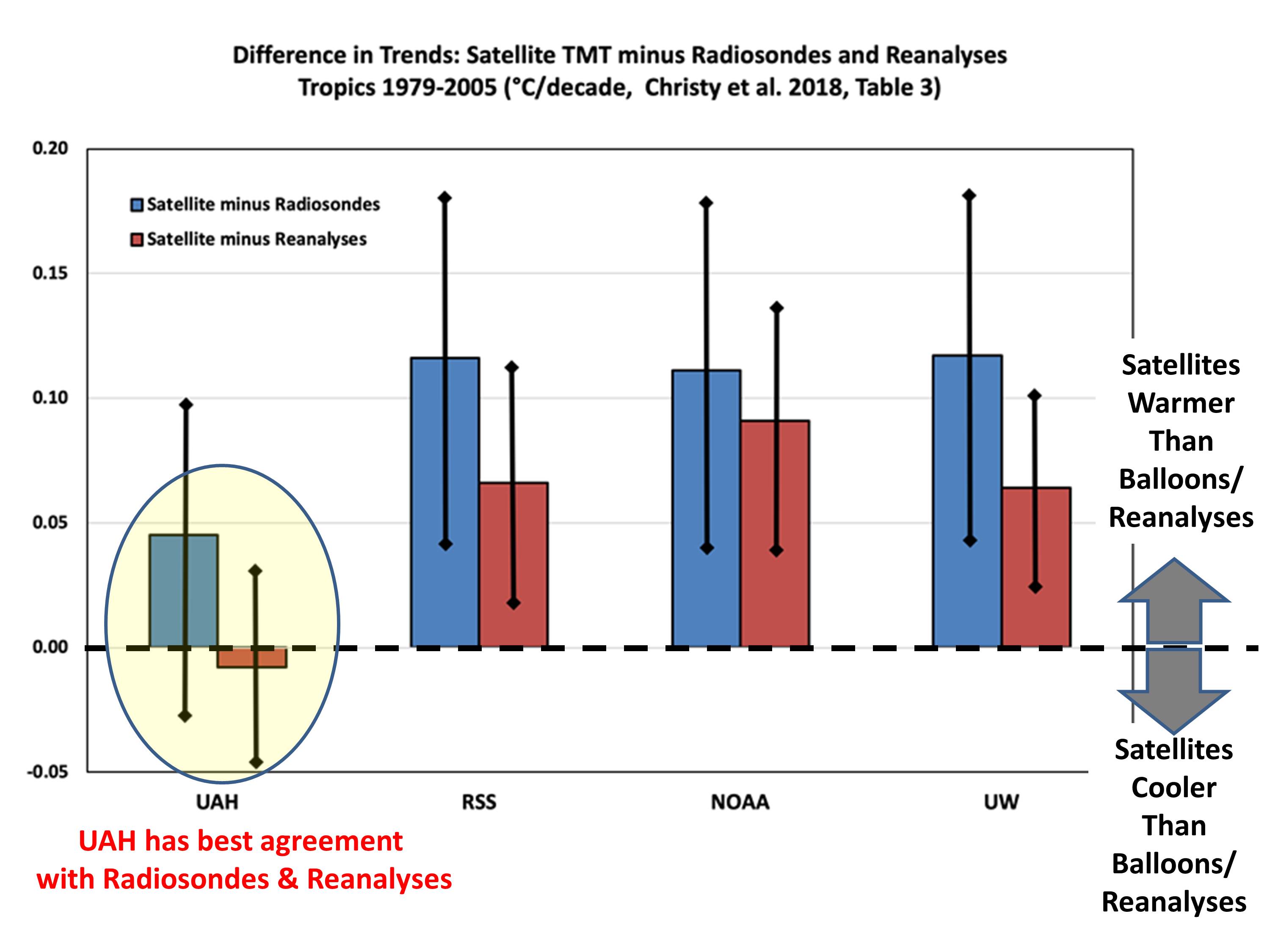
Third, UAH in fact has the closest agreement with radiosonde measurements. The other three satellites exaggerate warming and in that sense they, in fact, are the "outliers". (NB In the chart below, reanalyses = "homogenised" datasets.)

Sat-datasets-vs-sondes-reanalyses-tropics-Christy-et-al-2018.jpg


Fourth, RATPAC uses ~85 stations globally and is itself an outlier among radiosonde datasets. It was nevertheless included in Christy's dataset comprising 564 stations.
By the way, I live on the surface of the planet, not in the lower troposphere and the surface temperature data is more reliable, just less convenient for some.

Again, lower troposphere = air we breathe.

Where are you getting your terrestrial measurements from for points over the ocean and inside the Arctic circle?

What do you say to the point that Spencer's readings essentially agree with HadCRUT4, the land-based gospel, after the demise of NOAA-14?
 
Last edited:

Midsy

I am the one who knocks.
Jan 18, 2014
3,385
1,345
52
London
A genuine question.

This passage come from an article in the Age today:

“The government’s own figures under the Kyoto Protocol show emissions were 533 million tonnes in 2014, the first full year of the Coalition government, and were 530 million tonnes in 2019.”

How do governments accurately calculate emissions across a country? How do they account for all the possible emissions? Not just Australia, any country.
 
Jul 26, 2004
78,624
39,420
www.redbubble.com
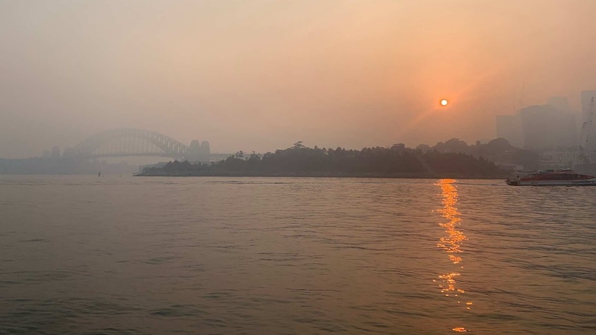
Today’s air quality in Melbourne is rated as hazardous. We are now getting what Sydney & Canberra have been putting up with for months now. Welcome to the new (apocalyptic) normal.
The Australian Open qualifiers are due to start today. Best tennis players in the world will be arriving to this. No doubt they’ll be wanting to catch the first plane out of the worlds sporting capital given the non breathable conditions.
Seriously what a ####### joke!
 
Last edited:

Giardiasis

Tiger Legend
Apr 20, 2009
6,906
1,314
Brisbane
Today’s air quality in Melbourne is rated as hazardous. We are now getting what Sydney & Canberra have been putting up with for months now. Welcome to the new (apocalyptic) normal.
The Australian Open qualifiers are due to start today. Best tennis players in the world will be arriving to this. No doubt they’ll be wanting to catch the first plane out of the worlds sporting capital given the non breathable conditions.
Seriously what a ####### joke!
iu
 
  • Like
  • Haha
Reactions: 3 users

tigerman

It's Tiger Time
Mar 17, 2003
24,347
19,921
A genuine question.

This passage come from an article in the Age today:

“The government’s own figures under the Kyoto Protocol show emissions were 533 million tonnes in 2014, the first full year of the Coalition government, and were 530 million tonnes in 2019.”

How do governments accurately calculate emissions across a country? How do they account for all the possible emissions? Not just Australia, any country.
Not sure how emissions are measured, but i remember reading that when the Hazelwood Power station closed it emitted about 15 million tonnes of CO2 every year.
530 million tonnes emitted in 2019 was 3 million less than the 533 in 2014. Hazelwood Power station emitted 15 million tonnes a year and closed in 2017. So in effect Australia's CO2 emissions have got worse........sort of.
 

MD Jazz

Don't understand football? Talk to the hand.
Feb 3, 2017
13,526
14,065
Today’s air quality in Melbourne is rated as hazardous. We are now getting what Sydney & Canberra have been putting up with for months now. Welcome to the new (apocalyptic) normal.
The Australian Open qualifiers are due to start today. Best tennis players in the world will be arriving to this. No doubt they’ll be wanting to catch the first plane out of the worlds sporting capital given the non breathable conditions.
Seriously what a ####### joke!

Seems you are more upset about tennis matches being impacted than anything else??

Non-breathable conditions? Sydney's air has been hazardous form "months" has it?

Reckon you need a lie down.
 
  • Like
Reactions: 1 users

HR

Tiger Superstar
Mar 20, 2013
2,444
1,523
Not sure how emissions are measured, but i remember reading that when the Hazelwood Power station closed it emitted about 15 million tonnes of CO2 every year.
530 million tonnes emitted in 2019 was 3 million less than the 533 in 2014. Hazelwood Power station emitted 15 million tonnes a year and closed in 2017. So in effect Australia's CO2 emissions have got worse........sort of.
Probably got a couple of million more people living in this great country.
 
  • Haha
  • Like
Reactions: 1 users

DavidSSS

Tiger Legend
Dec 11, 2017
10,719
18,363
Melbourne
Nice cherry picking there by Spencer and Christie et al.

Have a good look at the difference graph I posted which showed the variation between the balloon data compared to 2 satellite data sets UAH (Spencer and Christie) and RSS. If you were Spencer and Christie and you were going to pick a year which puts your data in the best light, which year would you pick? The year where the blue dot is the closest to 0 on the vertical axis and is closer than the red dot - which year would that be? Ooh it's 2005 the very year they used in their article. Why did they do this? The article came out in the middle of 2018, why stop at 2005? Could it be that 2005 fits their agenda the best?

But let's go further. It was nice of you to make a graph out of Christie, Spencer et al's table but what exactly is being measured here - is it world temperature? Well, no, it is temperature in the tropics only, specifically for latitudes from 20S to 20N, so it ain't the whole planet.

But while it was nice to go down the little rabbit hole of satellite measurements, it remains the case that surface temperature data is the best data, it is more accurate, look at this explainer:


You might also want to read this recent paper from NASA: https://climate.nasa.gov/news/2943/...are-getting-future-warming-projections-right/

It contains this graph:

1983


They have gone back to the forecasts of climate models from 2004 and the models' forecasts are trending the same way as the surface temperature record.

It is warming and we are seeing the effect now.

Time to take action.

DS
 
  • Like
Reactions: 1 user

Baloo

Delisted Free Agent
Nov 8, 2005
44,178
19,049
It's unknown territory but the Government needs to provide more information on the health risks of breathing hazardous air.
All AFL teams are training indoors today.

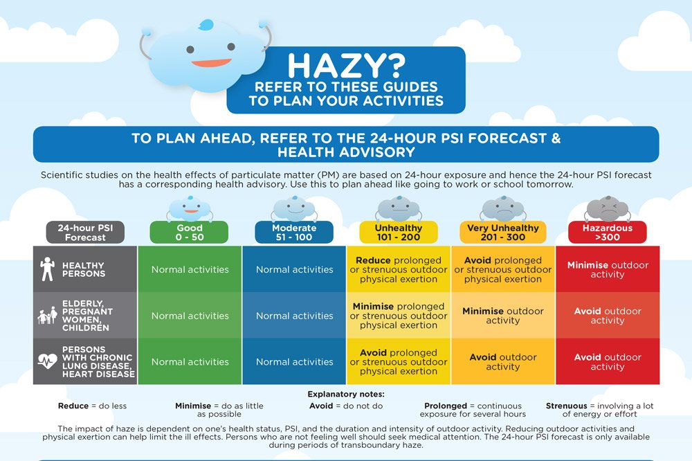
SE Asia often cop "Haze" which is the smoke from the fires in Indonesia & Malaysia. Happens every year, sometimes twice, and it can be very bad. Here's one of the flyers that instructs people and the dos and donts during haze. Might be handy for someone.

hazy.jpg
 

LeeToRainesToRoach

Tiger Legend
Jun 4, 2006
33,186
11,546
Melbourne
Nice cherry picking there by Spencer and Christie et al.

Have a good look at the difference graph I posted which showed the variation between the balloon data compared to 2 satellite data sets UAH (Spencer and Christie) and RSS. If you were Spencer and Christie and you were going to pick a year which puts your data in the best light, which year would you pick? The year where the blue dot is the closest to 0 on the vertical axis and is closer than the red dot - which year would that be? Ooh it's 2005 the very year they used in their article. Why did they do this? The article came out in the middle of 2018, why stop at 2005? Could it be that 2005 fits their agenda the best?

But let's go further. It was nice of you to make a graph out of Christie, Spencer et al's table but what exactly is being measured here - is it world temperature? Well, no, it is temperature in the tropics only, specifically for latitudes from 20S to 20N, so it ain't the whole planet.

But while it was nice to go down the little rabbit hole of satellite measurements, it remains the case that surface temperature data is the best data, it is more accurate, look at this explainer:


You might also want to read this recent paper from NASA: https://climate.nasa.gov/news/2943/...are-getting-future-warming-projections-right/

It contains this graph:

1983


They have gone back to the forecasts of climate models from 2004 and the models' forecasts are trending the same way as the surface temperature record.

It is warming and we are seeing the effect now.

Time to take action.

DS

Nice cut & paste video with snippets from the same few model gurus needlessly chopped up and spliced together out of context for effect. Naturally they are going to vouch for land-based measurements because there is a far longer history of observations compared with satellites. The truth is that both methods have strengrths and weaknesses. But this revisionist history serves no useful purpose; even the article states: "...while the relative simplicity of the models analyzed makes their climate projections functionally obsolete..."

If the models specify a high rate of uncertainty, then yes, it's possible to examine selected models and claim that the models were "accurate", within the extremes of that uncertainty. (For example the IPCC routinely cites a range of +1.5 to +4.5 degrees for ECS - the temperature increase resulting from a doubling of CO2. That is a BIG range.) Or to tweak selected variables so that the rate of warming looks approximately correct in hindsight.

So I answer your study with a study that shows climate models consistently overestimate warming by 30-45%. Models used by the IPCC overestimate climate sensistivity by close to double. This was published at Journal of Climate which is known for its readiness to publish pro-warming studies. It suggests the figure for ECS (equilibrium climate senstivity, mentioned above) is +1.66 - at the lower end of the IPCC range and about half the average of the IPCC models, but still within the bounds of IPCC uncertainty. Looked at in the simplest possible context, it might be claimed that this study validates IPCC model estimates, which it most certainly does not.
 
  • Like
Reactions: 1 user