
Not sure where this facebook account got this graph? Over 70million hectares burned in 1999-2000 (that's over 172 million acres).
-
IMPORTANT // Please look after your loved ones, yourself and be kind to others. If you are feeling that the world is too hard to handle there is always help - I implore you not to hesitate in contacting one of these wonderful organisations Lifeline and Beyond Blue ... and I'm sure reaching out to our PRE community we will find a way to help. T.
Global Warming
- Thread starter Disco08
- Start date
You are using an out of date browser. It may not display this or other websites correctly.
You should upgrade or use an alternative browser.
You should upgrade or use an alternative browser.
I've no idea why DSSS's posts get you so worked up L2, quite seriously, I don't. Your posting is no less infuriating to those of us who disagree with you. It has been pointed out ad nauseum that deliberately starting graphs at 1998 (a well established bit of bad science from deniers) skews your data because it was a stand out year within that very specific small window. That's cherry-picking my man pure and simple. (I've no idea why you would chose to die on that particular hill.) Viewed against a larger data set it becomes much less definitive, some say it disappears all together. So insisting on posting about it as though it is illustrative and robust seems disingenuous at best. Just bad faith at worst.
Last time I'm going to explain this.
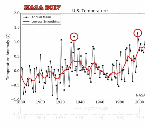
All climate records once clearly showed a pause/hiatus in global warming after 1998.
That pause no longer exists in official land-based temperature records.
Climate change whistleblower alleges NOAA manipulated data to hide global warming 'pause'
This is one of many alterations to climate records which, without exception, contribute to the narrative of today's climate as exceptional.
You dismiss Coburg's post about viewpoint bias, calling it a 'strawman' then immediately claim that data was adjusted specifically to fit a 'warmest' (leftist) narrative. That strawman seems to have more than a bit of flesh on him.
The post began with a statement about man contributing to global warming. That much is overwhelmingly likely. Coburg then falsely claimed it for the left.
The leftist bit is the alarmism.

Got it now. It's a conspiracy theory!
About time you twigged Baloo!! You can get all the truthiness you need from the video I posted above.
Find me one chart where the UAH readings have been altered. There are hundreds online. Find me one that looks as different as your alarmist horseshit.
The findings have been totally discredited as they used Ayn Rand calculators.
It's interesting Lee has not strayed into commentary on my video because he believes in that nutjobbery, but knows he will be exposed if he endorses it.
I don't put much store in parody videos (or memes), and don't have the patience to sit through 25 minutes of it.
I don't put much store in parody videos (or memes), and don't have the patience to sit through 25 minutes of it.
It's not a parody. It's a mirror.
Is it true that
- Australia is on target to meet its emissions obligations under the Paris Accord
- the big lefty grandstanding countries Canada, Germany and France are not?
- Australia is on target to meet its emissions obligations under the Paris Accord
- the big lefty grandstanding countries Canada, Germany and France are not?
It is the trend that matters, the pause after 1998 only appears if you take 1998 as the base year. 1998 was clearly an outlier (big ENSO, these things happen) and the following few years look flatter when you notice the big spike in 1998.
In any case, the article you linked to from Scientific American stated that satellite measurements were agreeing with ground measurements. But one notable thing about that article, it stated:
Note they are comparing to the AIRS satellite measure, which is closer to all the other satellite measures of temperature . . . except of course UAH which is, as usual, the outlier (at the cooler end of course which fits with Christy and Spencer's fossil fuel funded agenda):
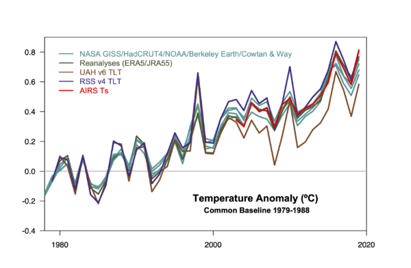
The trend over the whole period shown is clearly up, even around 2000, the satellite data tends to be more volatile but a pause? Maybe, but only if you ignore the trend. Since this is satellite data it only goes back to 1979 so the years are stretched out on the horizontal axis compared to a longer term graph.
I posted a chart of the UAH adjustments over time. I will add that I have no issue with them adjusting their measurements because we all know that satellites change, info about issues (such as satellite drift etc) gets better and techniques get better. But I will say it is interesting that version 6 of the UAH data is 0.043 warmer than the original UAH.
Nobody, not even Spencer and Christy, are claiming that it isn't warming any more (ok, maybe WUWT but they are wack jobs).
DS
In any case, the article you linked to from Scientific American stated that satellite measurements were agreeing with ground measurements. But one notable thing about that article, it stated:
“The estimates that we’re getting of the trends from the surface temperature network and ocean buoy network is matched to a ridiculous certainty by the trends that we’re getting from this remote sensing,” said NASA climate scientist Gavin Schmidt, a co-author on the study, which was led by fellow NASA scientist Joel Susskind.
The study focuses on a relatively recent NASA satellite measurement system known as the Atmospheric Infrared Sounder, or AIRS, that began collecting data in 2002. The system takes measurements of the Earth’s “skin temperature,” or the temperatures right at the surface of the planet.
Note they are comparing to the AIRS satellite measure, which is closer to all the other satellite measures of temperature . . . except of course UAH which is, as usual, the outlier (at the cooler end of course which fits with Christy and Spencer's fossil fuel funded agenda):
The trend over the whole period shown is clearly up, even around 2000, the satellite data tends to be more volatile but a pause? Maybe, but only if you ignore the trend. Since this is satellite data it only goes back to 1979 so the years are stretched out on the horizontal axis compared to a longer term graph.
I posted a chart of the UAH adjustments over time. I will add that I have no issue with them adjusting their measurements because we all know that satellites change, info about issues (such as satellite drift etc) gets better and techniques get better. But I will say it is interesting that version 6 of the UAH data is 0.043 warmer than the original UAH.
Nobody, not even Spencer and Christy, are claiming that it isn't warming any more (ok, maybe WUWT but they are wack jobs).
DS
The post began with a statement about man contributing to global warming. That much is overwhelmingly likely. Coburg then falsely claimed it for the left.
The leftist bit is the alarmism.
Please don't completely misrepresent me.
That is literally the opposite of what I said.
I am saying that the statement is apolitical. It does not belong to the left or right.
But if you believe, as some conservatives do, that "The earth is warming and human beings are contributing to it" is a left wing statement, you will consider all evidence based reporting on the matter left wing. Which is problematic, as right wing people who think a source is left wing, will ignore it. (Same as left wing people who believe a source is right wing, by the way).
Last time I'm going to explain this.
All climate records once clearly showed a pause/hiatus in global warming after 1998.
That pause no longer exists in official land-based temperature records.
Climate change whistleblower alleges NOAA manipulated data to hide global warming 'pause'
This is one of many alterations to climate records which, without exception, contribute to the narrative of today's climate as exceptional.
The post began with a statement about man contributing to global warming. That much is overwhelmingly likely. Coburg then falsely claimed it for the left.
The leftist bit is the alarmism.
Sorry L2 but the reason you keep getting push back is because you keep presenting the same graph that is intentionally skewed to present your case. When anyone presents anything else you claim the big bad cabal of scientists (the largest and most elaborate consipracy in history involving countless labs in countless languages - other than the one flerfers believe - would be required for you to be right) doctored the data.
you keep presenting the same graph that is intentionally skewed to present your case
Which graph is intentionally skewed? I purposely linked to three of them from different sources that show essentially the same thing, i.e. little or no warming in the period after 1998.
You're aware that the first two charts in this post are from the same source, right?
One shows a dominant peak in 1998; the second shows at least seven hotter years in the succeeding period to 2012.
Last edited:
But if you believe, as some conservatives do, that "The earth is warming and human beings are contributing to it" is a left wing statement
Oh you wicked man.
Oh you wicked man.
You seem really stuck on this.
You seem really stuck on this.
You seem stuck on reinforcing a point that isn't contentious.
Last time I'm going to explain this.
All climate records once clearly showed a pause/hiatus in global warming after 1998.
That pause no longer exists in official land-based temperature records.
Climate change whistleblower alleges NOAA manipulated data to hide global warming 'pause'
This is one of many alterations to climate records which, without exception, contribute to the narrative of today's climate as exceptional.
The post began with a statement about man contributing to global warming. That much is overwhelmingly likely. Coburg then falsely claimed it for the left.
The leftist bit is the alarmism.
Which graph is intentionally skewed? I purposely linked to three of them from different sources that show essentially the same thing, i.e. little or no warming in the period after 1998.
The one that shows the pause, the old data that begins at 1998. That decade has been shown time and again to live within a broader context of warming that has been unnervingly consistent. But as I have said so many times, discussing the minutiae of the science is pointless. None of us is well enough credentialed to draw conclusions from any of this. Pointing fingers and using perjoratives, like 'warmists', is just baiting. There is nothing new in there being dissenters in scientific disciplines. There is a well established process for them to be heard. They don't need blogs, or editorials they need peer-reviewed published theses that stand up to scrutiny. Ideas stand or fall on their merits. The system works. The reason we have nice things is because the system works.
When a lab published their study a few years ago appearing to show neutrinos arriving at a collector at faster-than-light speeds guess how they found out what was happening? They published, early. They knew they were being controversial but they thought they had accounted for all variables. Their peers did their work followed their methods and failed to reproduce the result. Another win for relativity. Many tests were performed, the machine that is 'peer-review' ground its gears and eventually a problem was found with their measuring equipment. This is how it works.
If those esposing your favoured hypothesis L2, have good science then it will out. Relativity isn't the standard bearer of physics because of a cabal saying you mustn't question Einstein, it is so because labs all over the world devise tests to see if they can break it down. Every time it holds, it is strengthened. So it goes with climate models. No one is drinking the koolaid here, not at the coal face. There may be 'commentators' or 'TV Scientists' who are prone to hyperbole but they don't run the labs.
Yawn, seen this before a number of times.
Look at the trend.
The increased frequency and severity of bushfires in Australia was predicted, as was rain falling south of Australia in the ocean when weather patterns used to see rain fall over the South East of our continent:
The predictions of climate scientists are happening now.
This is climate change, and it will only get worse if we do nothing about it.
DS
The one that shows the pause, the old data that begins at 1998.
Which one?
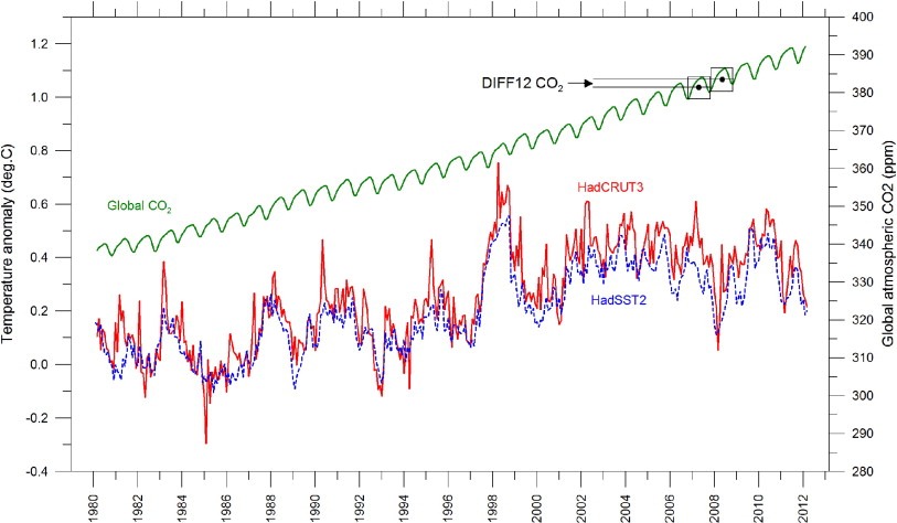
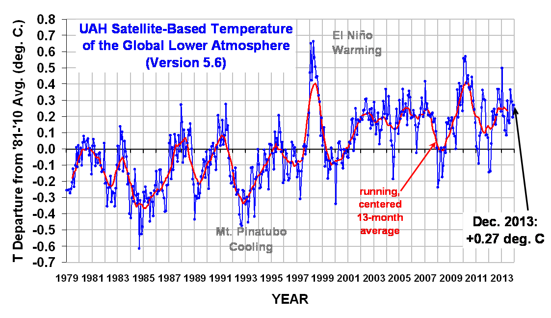
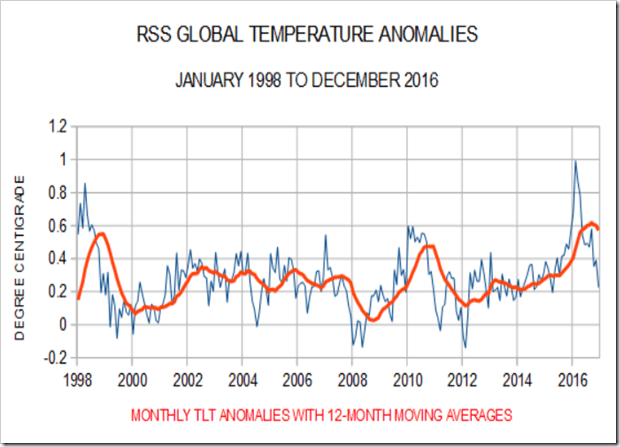
Does any one of these charts look substantially different to the others for 1998-2012?
